The lattice library is useful for quickly making plots of multivariate data. It's easy to make plots which condition on one or more variables.
Load the lattice library
library(lattice)

# Ask for general information about the lattice package
`?`(package, lattice)

# See what is inside of the lattice package. It includes some datasets.
library(help = lattice)

# Load the New York City environmental dataset.
data(environmental)
`?`(environmental)
head(environmental)
##   ozone radiation temperature wind
## 1    41       190          67  7.4
## 2    36       118          72  8.0
## 3    12       149          74 12.6
## 4    18       313          62 11.5
## 5    23       299          65  8.6
## 6    19        99          59 13.8
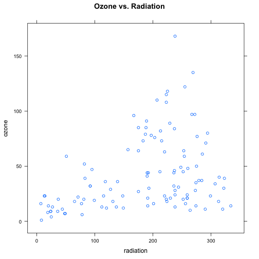
Plot ozone vs. radiation using xyplot
xyplot(ozone ~ radiation, data = environmental, main = "Ozone vs. Radiation")
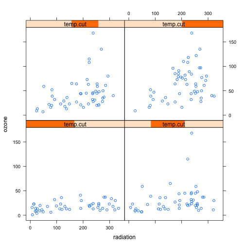
Investigate the relationship between ozone and radiation change as temperature changes
To address this, break temperature into 4 overlapping ranges using the equal.count function.
summary(environmental$temperature)
##    Min. 1st Qu.  Median    Mean 3rd Qu.    Max.
##    57.0    71.0    79.0    77.8    84.5    97.0
# Cut the temperature variable into four different ranges.
temp.cut <- equal.count(environmental$temperature, 4)
temp.cut
##
## Data:
##   [1] 67 72 74 62 65 59 61 69 66 68 58 64 66 57 68 62 59 73 61 61 67 81 79
##  [24] 76 82 90 87 82 77 72 65 73 76 84 85 81 83 83 88 92 92 89 73 81 80 81
##  [47] 82 84 87 85 74 86 85 82 86 88 86 83 81 81 81 82 89 90 90 86 82 80 77
##  [70] 79 76 78 78 77 72 79 81 86 97 94 96 94 91 92 93 93 87 84 80 78 75 73
##  [93] 81 76 77 71 71 78 67 76 68 82 64 71 81 69 63 70 75 76 68
##
## Intervals:
##    min  max count
## 1 56.5 76.5    46
## 2 67.5 81.5    51
## 3 75.5 86.5    51
## 4 80.5 97.5    51
##
## Overlap between adjacent intervals:
## [1] 27 30 31
# Default layout. This orders panel from left to right, bottom to top.
xyplot(ozone ~ radiation | temp.cut, data = environmental)
# One column layout.
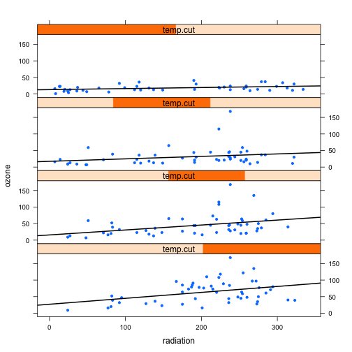
xyplot(ozone ~ radiation | temp.cut, data = environmental, layout = c(1, 4))
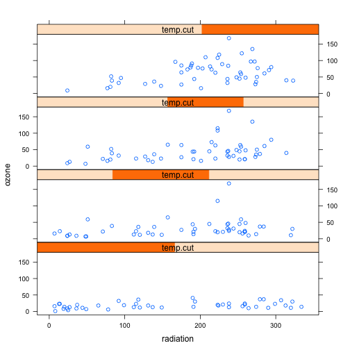
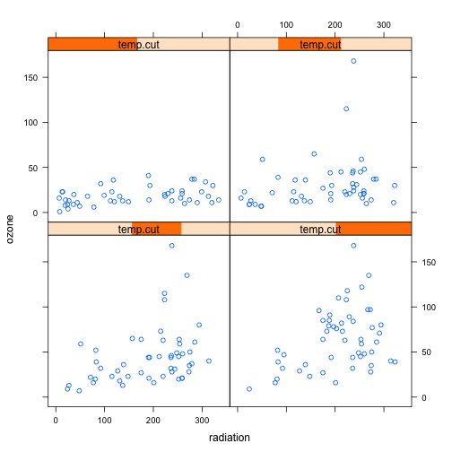
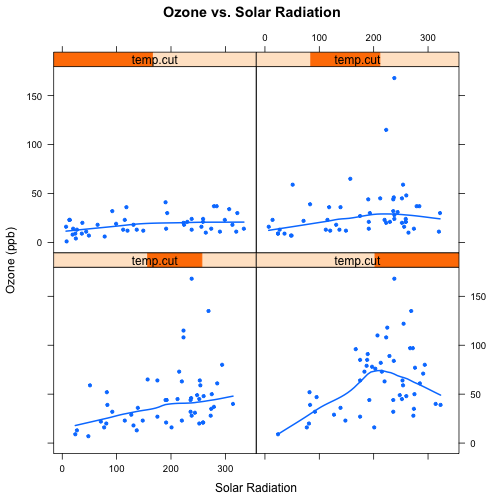
Use the as.table argument to draw panels in order from left to right, top to bottom.
# One column, in ascending order of temperature range.
xyplot(ozone ~ radiation | temp.cut, data = environmental, as.table = TRUE)
Add a fit to each panel.
Add a fit to each panel using a custom panel function. Note the use of ... which allows for the xyplot parameters such as pch to be passed through the custom panel function.
xyplot(ozone ~ radiation | temp.cut, data = environmental, layout = c(1, 4),
    as.table = TRUE, pch = 20, panel = function(x, y, ...) {
        panel.xyplot(x, y, ...)
        fit <- lm(y ~ x)
        panel.abline(fit, lwd = 2)
    })
xyplot(ozone ~ radiation | temp.cut, data = environmental, as.table = TRUE,
    pch = 20, panel = function(x, y, ...) {
        panel.xyplot(x, y, ...)
        panel.loess(x, y, lwd = 2)
    }, xlab = "Solar Radiation", ylab = "Ozone (ppb)", main = "Ozone vs. Solar Radiation")
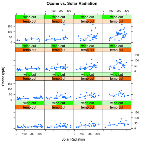
Condition on both wind and temperature.
wind.cut <- equal.count(environmental$wind, 4)
wind.cut
##
## Data:
##   [1]  7.4  8.0 12.6 11.5  8.6 13.8 20.1  9.7  9.2 10.9 13.2 11.5 12.0 18.4
##  [15] 11.5  9.7  9.7 16.6  9.7 12.0 12.0 14.9  5.7  7.4  9.7 13.8 11.5  8.0
##  [29] 14.9 20.7  9.2 11.5 10.3  4.0  9.2  9.2  4.6 10.9  5.1  6.3  5.7  7.4
##  [43] 14.3 14.9 14.3  6.9 10.3  6.3  5.1 11.5  6.9  8.6  8.0  8.6 12.0  7.4
##  [57]  7.4  7.4  9.2  6.9 13.8  7.4  4.0 10.3  8.0 11.5 11.5  9.7 10.3  6.3
##  [71]  7.4 10.9 10.3 15.5 14.3  9.7  3.4  8.0  9.7  2.3  6.3  6.3  6.9  5.1
##  [85]  2.8  4.6  7.4 15.5 10.9 10.3 10.9  9.7 14.9 15.5  6.3 10.9 11.5  6.9
##  [99] 13.8 10.3 10.3  8.0 12.6  9.2 10.3 10.3 16.6  6.9 14.3  8.0 11.5
##
## Intervals:
##     min   max count
## 1  2.05  9.45    49
## 2  6.65 10.55    50
## 3  8.95 12.85    47
## 4 10.05 20.95    53
##
## Overlap between adjacent intervals:
## [1] 31 25 32
xyplot(ozone ~ radiation | temp.cut * wind.cut, data = environmental, as.table = TRUE,
    pch = 20, panel = function(x, y, ...) {
        panel.xyplot(x, y, ...)
        panel.loess(x, y)
    }, xlab = "Solar Radiation", ylab = "Ozone (ppb)", main = "Ozone vs. Solar Radiation")
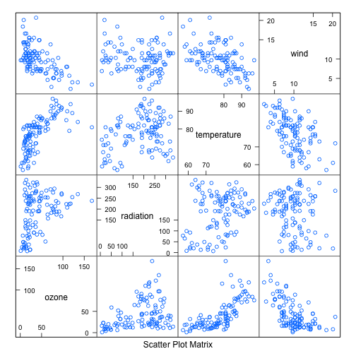
splom
Use splom to draw conditional scatter plot matrices.
splom(~environmental)
histogram
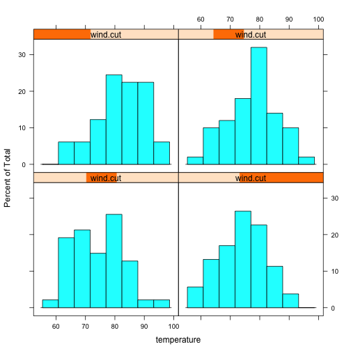
histogram(~temperature | wind.cut, data = environmental, as.table = TRUE)
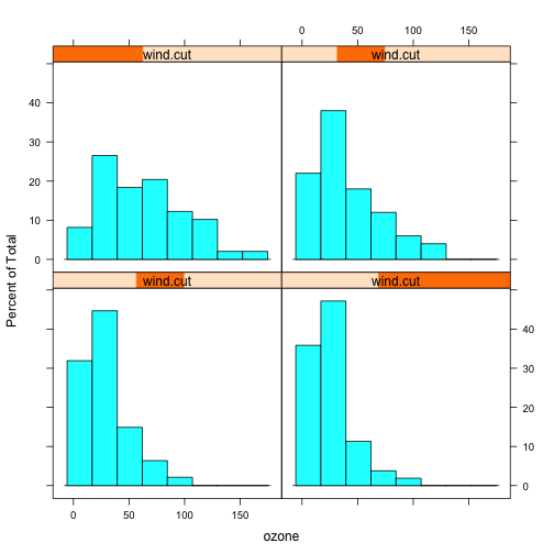
histogram(~ozone | wind.cut, data = environmental, as.table = TRUE)
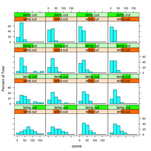
histogram(~ozone | wind.cut * temp.cut, data = environmental, as.table = TRUE)
comments powered by Disqus